
Accessible CSS Clamp Calculator
Responsive design should scale naturally, not snap awkwardly between breakpoints.
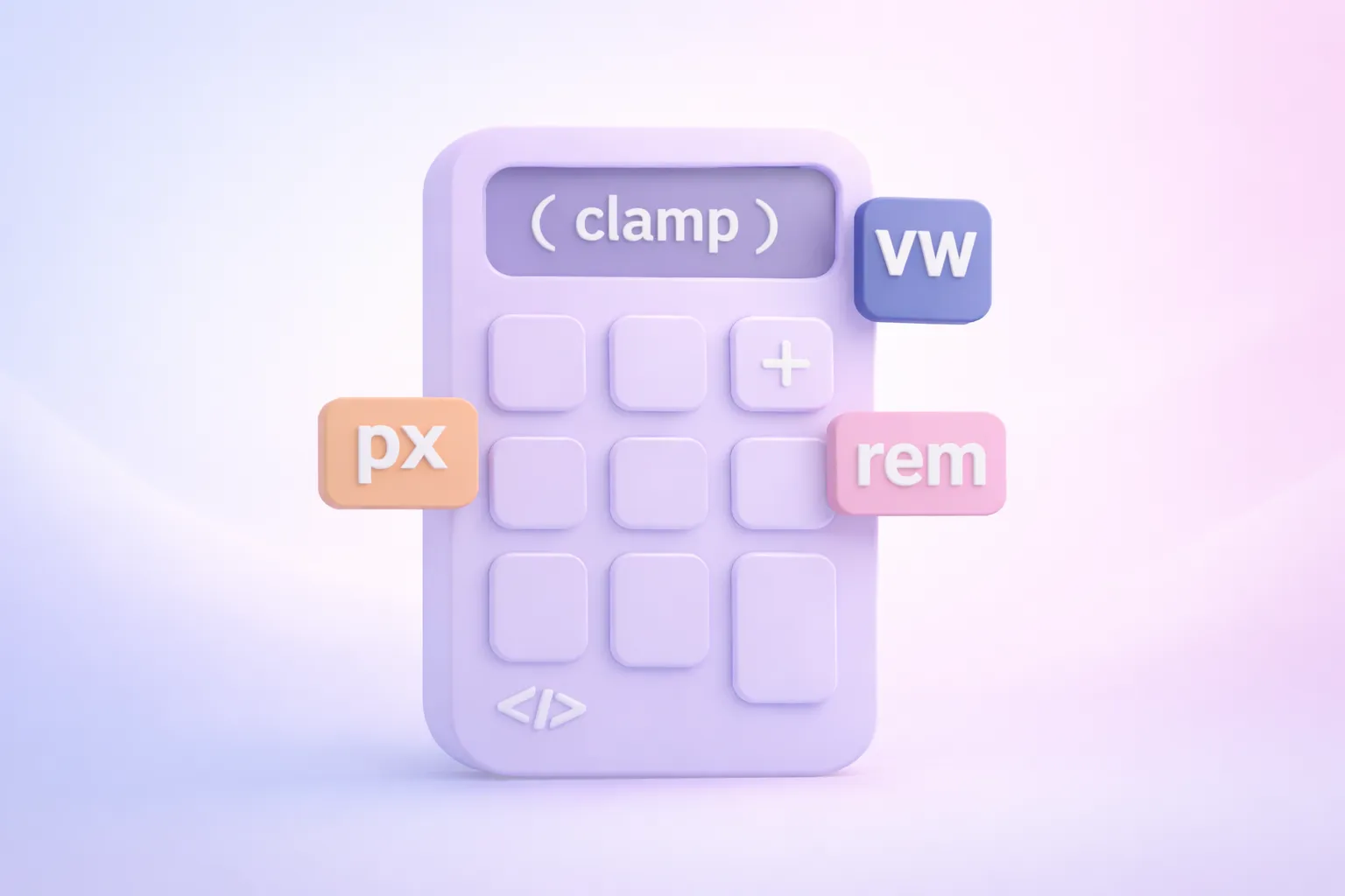
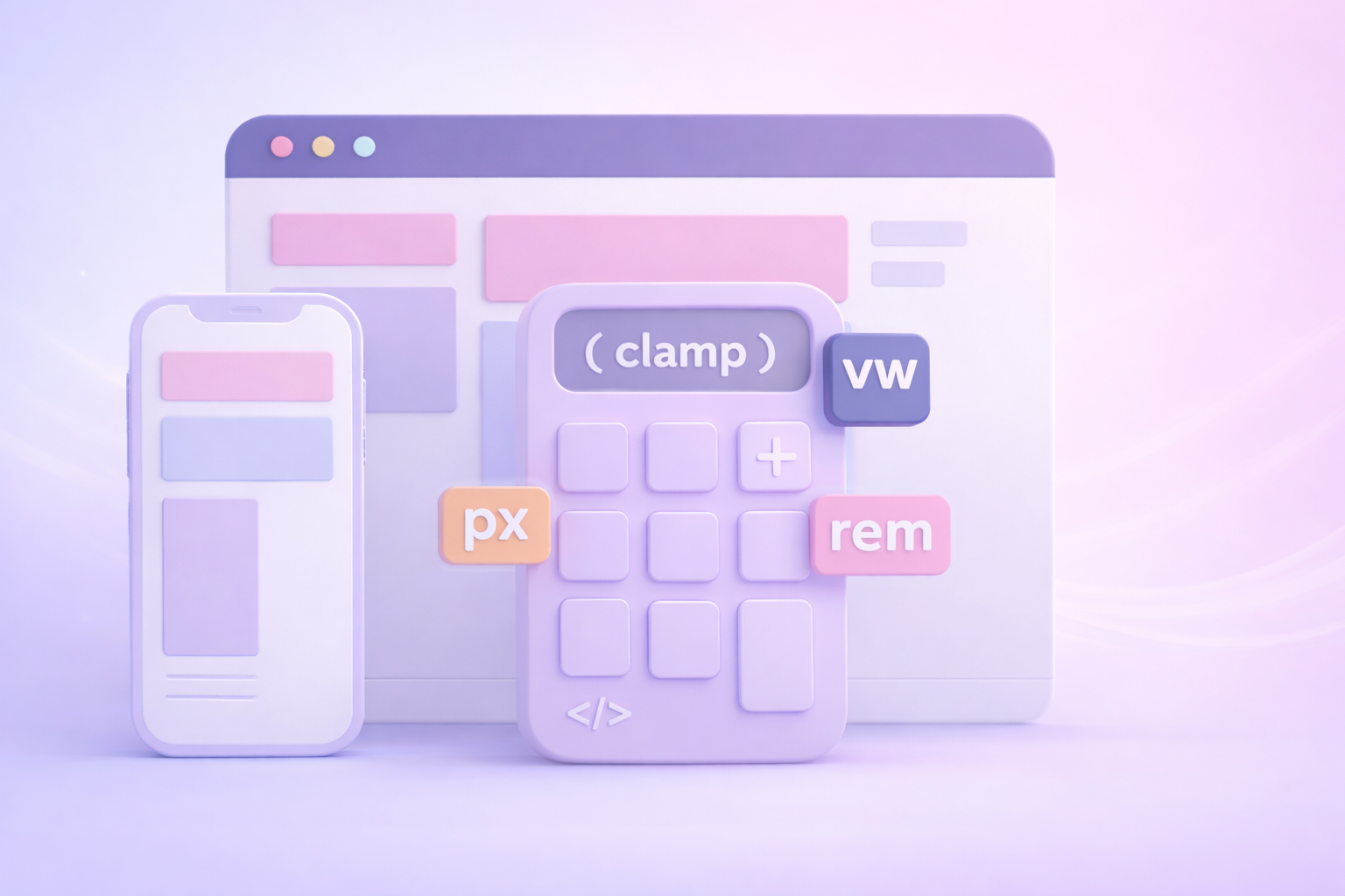
Our CSS Clamp Calculator helps you generate precise clamp() values for responsive typography and spacing, using real-world viewport sizes and rem-based values. It is designed for designers and developers working in Webflow, especially when translating static designs from Figma into fluid, production-ready layouts.
What Is CSS Clamp and Why It Matters
The CSS clamp() function allows a value to scale fluidly between a minimum and maximum size based on viewport width.
Instead of relying on multiple media queries, clamp() lets you define a single responsive rule that adapts automatically across screen sizes. This results in smoother typography, fewer breakpoints, and more maintainable CSS.
In practice, clamp() helps you create layouts that feel intentional at every screen size, not just the ones you designed for.
Why Use Clamp Instead of Media Queries
Traditional responsive design often relies on breakpoints that cause text and spacing to jump suddenly from one size to another. These jumps can feel jarring, especially on devices that fall between common breakpoints.
Using clamp() allows you to:
- Create fluid, continuous scaling
- Reduce the number of media queries in your CSS
- Maintain consistent visual rhythm across devices
- Build layouts that adapt naturally to screen size changes
For Webflow projects, this means cleaner, smoother responsive styles and fewer overrides as your site grows.

Good Design Is Inclusive Design
Responsive sizing is not only about how a design looks, it is about how it feels to use. Text that scales smoothly across screen sizes reduces cognitive effort, supports comfortable reading, and avoids the frustration that comes from layouts that feel cramped or oversized. When typography and spacing adapt naturally, users spend less time adjusting zoom settings and more time engaging with the content.
Fluid design also respects the reality that people use the web in different ways. Some users rely on larger default text sizes, some browse on devices that do not align neatly with common breakpoints, and others switch frequently between orientations or window sizes. Designs that scale continuously instead of jumping between fixed values are more resilient and more usable in these real-world scenarios.
Inclusive design choices tend to produce better outcomes for everyone. When layouts are flexible, readable, and predictable, they feel more polished and professional. Using tools like clamp() helps you build interfaces that work across devices and preferences without special cases, reinforcing the idea that good design is not about exclusion or perfection, but about adaptability.
Frequently Asked Questions
Q: What base font size does this calculator use?
A: This calculator assumes a base font size of 16px = 1rem, which matches browser and Webflow defaults.
Q: Can I use clamp values in Webflow?
A: Yes. Webflow fully supports clamp() values for typography, spacing, and layout properties.
Q: Is clamp only for font sizes?
A: No. While it is commonly used for typography, clamp() can also be applied to margins, padding, gaps, widths, and other size-related properties.
Q: Do I still need media queries if I use clamp?
A: In many cases, no. Clamp can replace multiple breakpoint-based rules, though media queries may still be useful for layout changes.
Q: Is this calculator accessible?
A: Yes. The calculator is keyboard accessible, screen reader friendly, and provides live previews and copy functionality without relying on visual-only interactions.
Still have questions?
If you are building a responsive Webflow site and want help creating scalable, inclusive design systems, you can book a strategy session below.