
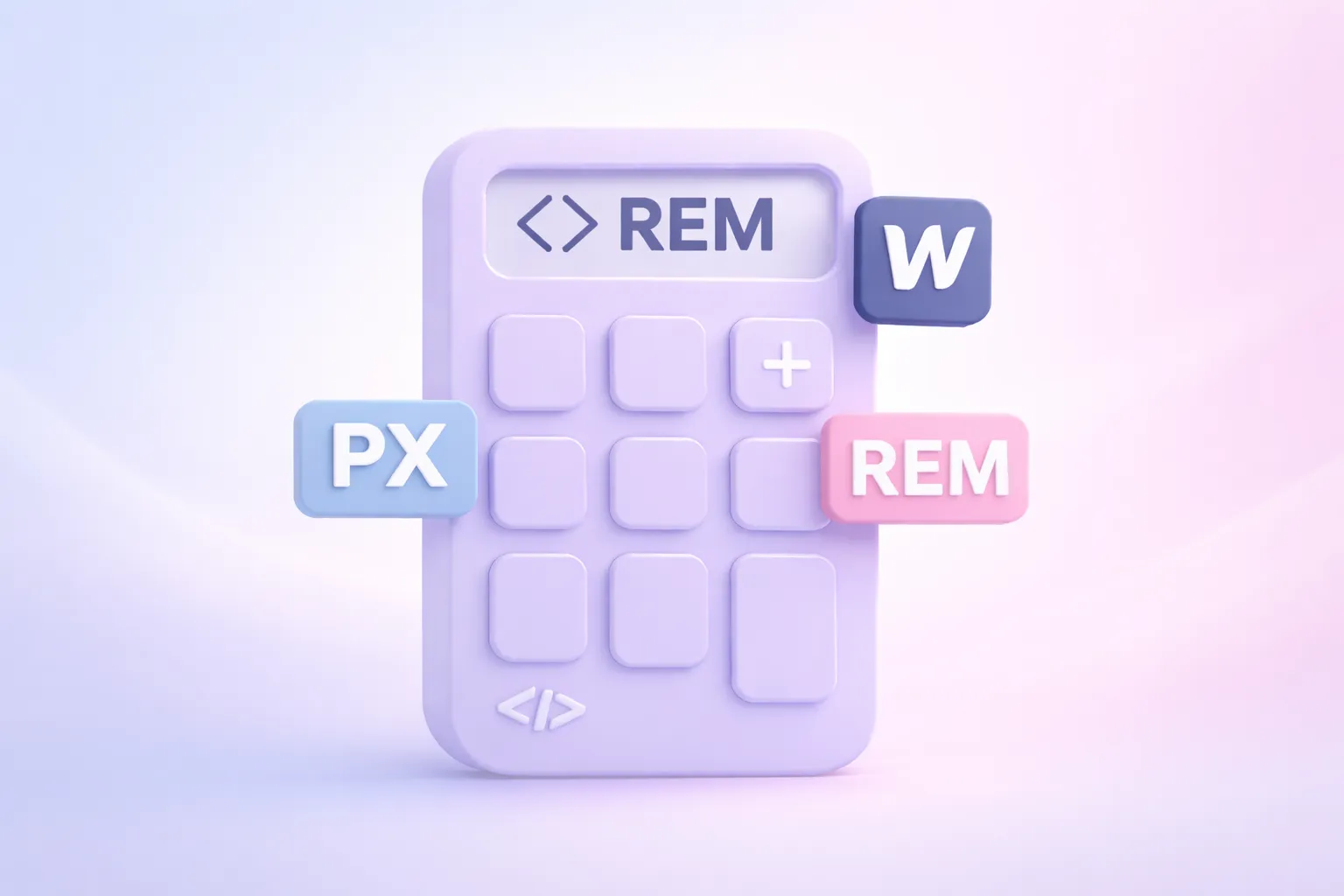
Accessible PX to REM Converter
Designing and developing accessible websites requires more than visual precision. It requires using units that respect user preferences, browser settings, and assistive technology.
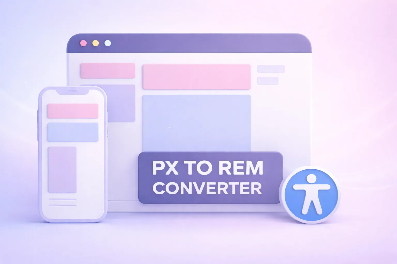
Our Accessible PX ↔ REM Converter provides a simple, accurate way to convert pixel values to rem units and back, using a fixed base font size of 16px = 1rem. It is built specifically for designers and developers working in Webflow, especially when translating designs from Figma into production-ready, accessible code.
Why REM Units Matter for Accessibility
Pixels are absolute. Rem units are relative. That difference is critical for accessibility.
When text sizes are defined in pixels, users who increase their browser’s default font size may see little or no change. This creates barriers for people with low vision, cognitive disabilities, or reading fatigue.
Rem units scale relative to the root font size, which means:
- Text responds to user browser settings
- Zooming and text resizing behave predictably
- Layouts remain flexible across devices
- Content aligns with WCAG 2.2 guidance on text resizing and readability
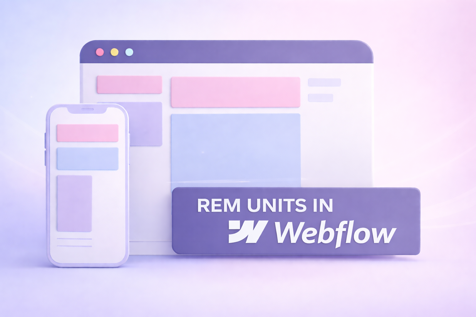
Why Use REM Instead of PX in Webflow
Webflow supports both pixel and rem units, but rem is the better choice for most typography and spacing decisions.
Using rem units in Webflow allows you to:
- Build scalable type systems
- Maintain consistent spacing across breakpoints
- Support user-defined text size preferences
- Reduce the risk of accessibility failures related to text resizing
If you are working from a Figma design that uses pixel values, converting those values to rem before implementation is a best practice.
Accessibility Isn’t Optional. It’s Built In.
his PX ↔ REM converter is designed to work for people, not just calculations. Many online converters focus only on math and overlook how real users interact with tools, especially those using keyboards, screen readers, or custom browser settings. Accessibility was considered from the start, not added later.
The calculator uses semantic HTML, properly labeled form controls, and keyboard-accessible interactions. Value changes are announced to screen reader users using live regions, copy actions provide non-visual feedback, and no functionality relies on hover, color alone, or visual cues. The experience is predictable, understandable, and usable across assistive technologies.
We believe inclusive design is good design. That’s why we work with clients who share that vision.
Frequently Asked Questions
Q: How accurate is the estimate from the calculator?
A: It’s a rough estimate based on typical project timeframes and our hourly rates. We’ll confirm scope in a consultation and follow up with a more accurate estimate tailored to your business needs.
Q: Is accessibility really included in every project?
A: Yes. Every project is built to WCAG 2.2 AA standards to the very best of our ability. We believe in building for everyone equally and want your website to be accessible to the largest possible audience.
Q: What if I already have a design?
A: Great! You can select “Bringing My Own Design” in Step 2 and this will be added for no additional cost and we’ll build from your files. We would love to partner with your designer during the design phase also.
Q: How do I know if I need SEO or AEO?
A: If you want to be found on Google or AI tools like ChatGPT, AEO is key. Choose your optimization level during the estimate. Graceful Web Studio specializes in Advanced SEO and AEO to get your website ranked.
Q: How do I get started?
A: Getting started is easy! Simply enter your project details into the calculator and hit 'Calculate.' You'll receive an estimate tailored to your specifications in just a few moments. Then schedule a free follow-up meeting with Crystal to discuss your results and talk strategy.
Still have questions?
We're here to help you!