How to Fix Webflow Dropdown Menus That Don’t Collapse on Focus Out
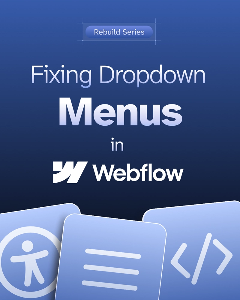

If you’ve ever built a dropdown or mobile menu in Webflow—especially using a pre-built component from Relume—you may have noticed an annoying behavior: the menu doesn’t collapse when a user tabs or clicks away.
This isn't just a design quirk. It’s a usability failure, and it can also result in a WCAG 2.2 accessibility violation.
Let’s walk through:
In Webflow, the native mobile nav component and many third-party menu systems open the menu with a toggle button, but they don’t provide a method to collapse the menu if focus leaves the menu.
So if a keyboard user tabs past the last focusable item in the dropdown, the menu stays open—covering meaningful content on the page and potentially confusing users who think they’re interacting with what’s behind it.
This breaks a key rule of accessible design: users must always be able to see where their focus is.
According to WCAG 2.2 Success Criterion 2.4.7: Focus Visible:
"Any keyboard-operable user interface has a mode of operation where the keyboard focus indicator is visible."
If your menu stays expanded when focus moves elsewhere—and that focus target is now covered by the open menu—you’re violating this requirement. All interactive elements must be visible when focused.
This isn’t just bad for screen reader or keyboard users. It’s annoying for mouse and touch users, too. A menu that lingers when you’ve already moved on is a frustrating experience.
Webflow gives us limited control over the built-in w-nav-overlay and w-nav-button elements that power their native navigation system. And if you’re using prebuilt UI kits like Relume, this behavior often goes unaddressed.
Most menus don’t collapse unless the user actively clicks the menu button again—which is not intuitive or keyboard-friendly.
That’s why I use this focus-out script on almost every project.
Drop this script into your Webflow Project Settings inside the Global Footer Code block:
<script>
  document.addEventListener('DOMContentLoaded', () => {
    setTimeout(() => {
      function WebflowNavMobile() {
        const navOverlay = document.querySelector('.w-nav-overlay');
        const navButton = document.querySelector('.w-nav-button');

        // Ensure required elements exist
        if (!navOverlay) {
          console.error('Error: .w-nav-overlay not found.');
          return;
        }

        if (!navButton) {
          console.error('Error: .w-nav-button not found.');
          return;
        }

        // Collapse menu when focus leaves the nav overlay
        navOverlay.addEventListener('focusout', (event) => {
          if (!navOverlay.contains(event.relatedTarget)) {
            navButton.click();
          }
        });

        // Collapse menu when Escape key is pressed
        navOverlay.addEventListener('keydown', (event) => {
          if (event.key === 'Escape') {
            navButton.click();
          }
        });
      }

      // Initialize the mobile navigation behavior
      WebflowNavMobile();
    }, 1000);
  });
</script>
Why This Works.w-nav-overlay element and simulates a click on the .w-nav-button to close the menuEscape key so users can manually collapse itI’ve tested this method on dozens of Webflow projects using Relume and native nav components—and it works beautifully nearly every time.
If your mobile or dropdown menus stay open when focus leaves, you’re introducing both usability friction and accessibility barriers. That’s a lose-lose.
As a Webflow accessibility specialist, I’ve worked hard to identify practical scripts like this that fill the platform’s gaps without rewriting your entire navigation system.
✅ Add this script to your Webflow project and test with keyboard navigation (Tab key and Shift + Tab).
If you’d like help testing or remediating your Webflow site’s accessibility, reach out.
👉 Graceful Web Studio – Webflow Accessibility and SEO Experts
Let’s make your menus—and your entire site—work better for everyone.
We build accessible, conversion-focused Webflow websites for businesses across Yakima and the US. Crystal Scott is a Certified Professional in Web Accessibility (CPWA) with 11+ years of front-end experience.
Our services:
Transparent pricing on every service page. Request a quote and get a response within one business day.

Search engines and AI read your site through the accessibility tree, now the top factor in Google's agentic browsing score.
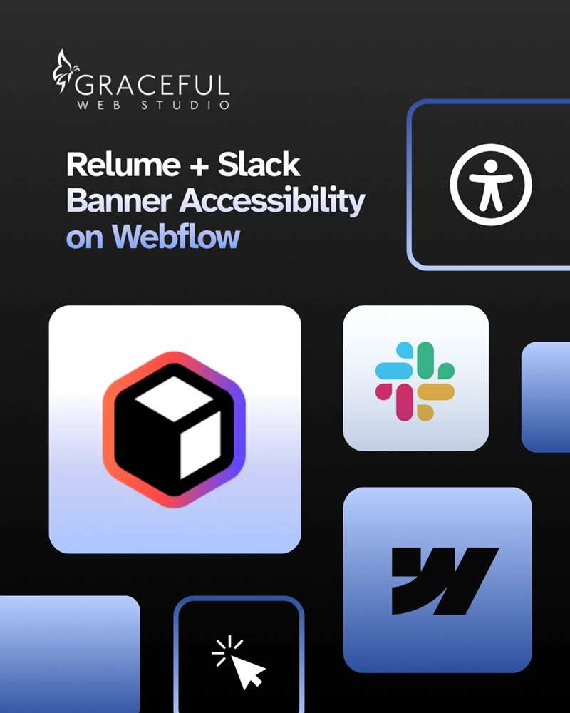
How I made a Relume banner accessible in Webflow and what you should always check before using any component in your own project.
.webp)
A jumpy page makes people tap the wrong thing and makes AI agents fail. Layout stability is the second factor in the agentic browsing score.
We would love to meet with you face-to-face. Whether virtually or for a coffee. Request a free project quote, and let’s find the right solution for you! We review your site, set-up a disocvery session and map out goals for a website that grows your business.