Why We Use Client-First in Webflow Development
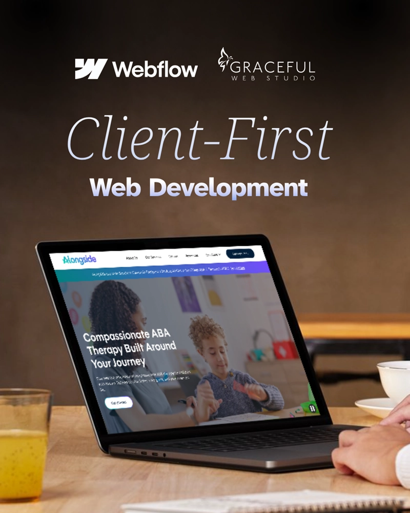

Why Graceful Web Studio Uses the Client-First Naming Convention
At Graceful Web Studio, clarity, accessibility, and long-term maintainability are at the core of everything we build. That’s why we use the Client-First naming convention for every Webflow project we touch.
Client-First isn't just a trend—it's a system that supports collaboration, scalability, and non-technical clients who want control over their content without digging through mystery classes or cryptic shorthand.
"Client-First" is a widely used framework for Webflow development created by Finsweet. It’s a collection of naming conventions, HTML structure strategies, and organizational principles designed to make websites easy to scale, manage, and understand—especially for non-technical stakeholders.
Client-First is more than a naming convention—it’s a philosophy of clarity, ownership, and long-term thinking.
Webflow empowers visual development—but what happens after launch? Too often, websites become unmanageable for clients because of confusing class structures. Client-First flips that script.
The goal is in the name:
With Client-First, our clients aren’t left guessing—they’re confident and capable.
In Client-First, we organize classes by two main categories—custom classes and utility classes—using the underscore (_) as our visual delimiter.
header-primary_contenttext-color-primaryThis distinction makes it incredibly easy to scan, manage, and distinguish between global utilities and unique structural classes.
Client-First naming uses a consistent, scalable structure based on prefixes and keywords that explain both purpose and layout relationships:
.hdng-sm or .cntnr-main. Instead, we write .heading-small or .container-main..section-home-hero, you know exactly what it’s for.section-container-heading-text-button-padding-, margin-, etc.These naming conventions make class purposes immediately obvious.
In every Client-First build—including those at Graceful Web Studio—we follow Finsweet’s recommendation to use rem units instead of pixels. rem stands for root em, and it references the root <html> element’s font size.
This isn’t just a developer preference. It’s an accessibility win.
When users adjust their browser’s font size or use zoom functionality, a rem-based layout responds gracefully. Text remains readable. Layouts don’t break. People with low vision or cognitive challenges can scale content the way they need to.
And it’s not just us—Client-First was built around rem for this exact reason.
So when we say accessibility is baked into every line of code, we mean it—even down to how we measure margins and text.
Need a handy tool while developing? We love using the NekoCalc REM Converter to quickly convert px to rem and keep things consistent.
Client-First isn’t just for our internal team. It works across the board:
When your site evolves, your class structure shouldn’t collapse. Client-First supports scalability:
We treat class naming as part of your content strategy and long-term success—not an afterthought.
If you're ready to learn Client-First for yourself, we highly recommend Finsweet’s Client-First 7-Day Learning Path. It’s a focused, week-long program packed with everything you need to understand the framework from the ground up—perfect for designers, developers, and teams who want to build better in Webflow.
Client-First is developed by Finsweet, and it’s one of the best decisions we’ve made for our builds. Want to learn how we implement it on your next project?
📩 Let’s talk about how a well-structured Webflow site makes accessibility, growth, and ownership easier—for everyone involved.
At Graceful Web Studio, we build with our clients and their clients in mind.
We build accessible, conversion-focused Webflow websites for businesses across Yakima and the US. Crystal Scott is a Certified Professional in Web Accessibility (CPWA) with 11+ years of front-end experience.
Our services:
Transparent pricing on every service page. Request a quote and get a response within one business day.
We would love to meet with you face-to-face. Whether virtually or for a coffee. Book a call, and let’s find the right solution for you! We review your site, map goals, and then deliver a clear plan and quote.