Google's Agentic Browsing Lighthouse Scoring Factor: The Well-Formed Accessibility Tree

Part 1 of the AI Visibility Series. The machine-eye view of your website, and why it now decides whether AI can find you.
On May 19, 2026, Google changed how search works, and quietly handed every business owner a scorecard for the AI era. Most people are still trying to read it. This series breaks it down, one piece at a time, starting with the piece that matters most.
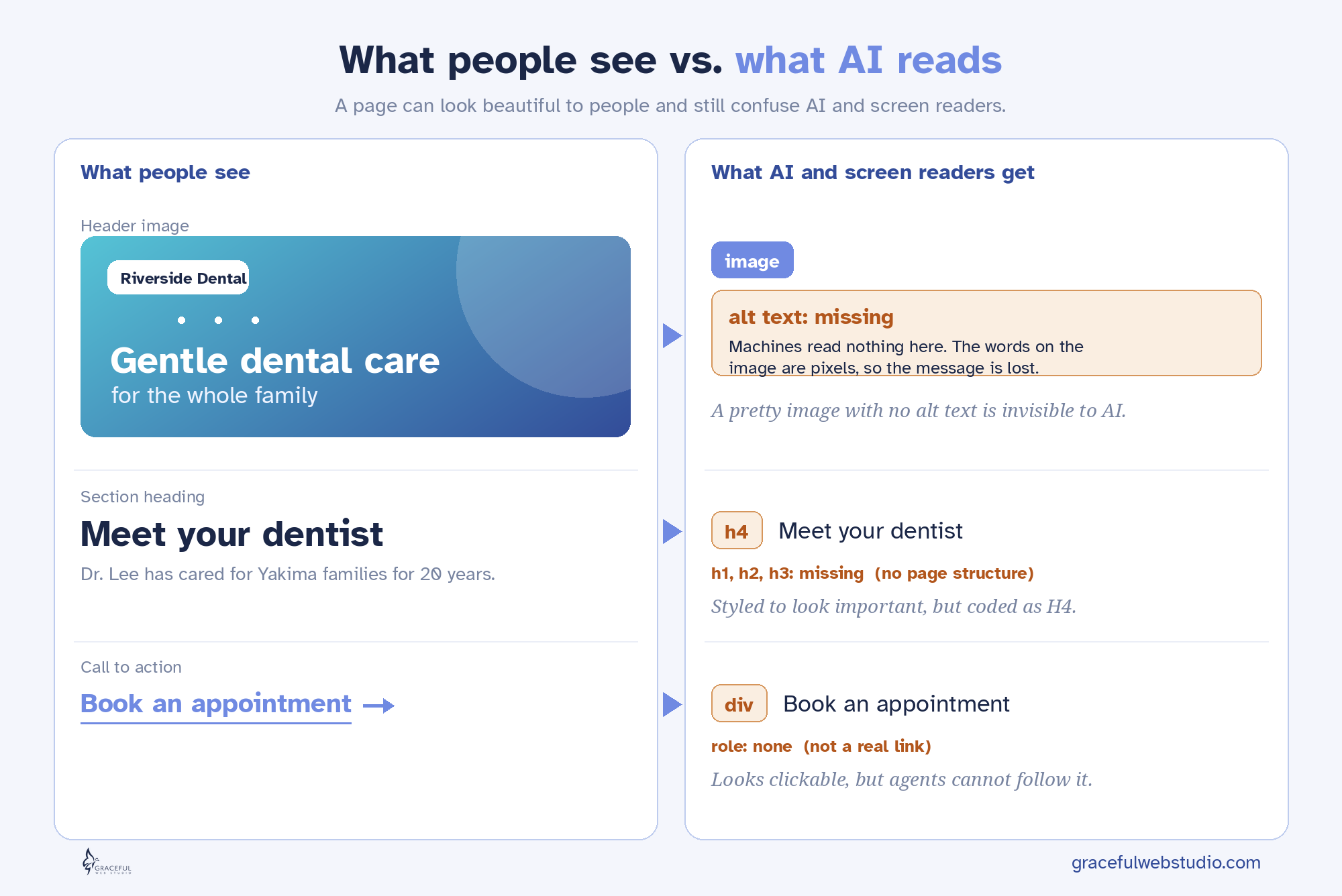
Here is the part almost no one is saying out loud: search engines and AI agents are blind. Not careless, not lazy. Blind, in the most literal sense. They do not see your beautiful hero image, your brand colors, or your clever button hover effect. They experience your website the same way a person using a screen reader does. Through code, structure, and labels. Nothing else.
If you have ever cared about whether a blind customer could use your site, you already understand how to get found by AI. You have been doing the work all along. Let me show you why.
When a browser loads your page, it builds two things. The first is the visual page you see, the colors and images and layout. The second is invisible, and it is called the accessibility tree.
The accessibility tree is a stripped-down map of your page that lists what every meaningful element is, what it is called, and what it is doing. A button. Named “Book a consultation.” Currently enabled. A heading. Named “Our services.” Level two. This is the version of your website that screen readers have always read aloud to people who cannot see the screen.
And now it has a second audience. AI agents rely on the accessibility tree as their primary data model. When an AI tries to understand or use your site, it reviews the accessibility tree to identify the interactive elements, exactly like a screen reader does. Google's own guidance confirms that browser agents interpret the accessibility tree, inspect your code structure, and read visual renderings to get their work done.
So the accessibility tree is no longer just an accessibility feature. It is the machine-eye view of your entire website. If it is clear, AI understands you. If it is a mess, AI moves on.
Here is what changed, and why accessibility just became the highest-leverage work on your website.
Google's Lighthouse tool has always graded sites in four areas: performance, accessibility, best practices, and SEO. Accessibility was one of the four. Important, but easy for busy owners to skip.
Now Lighthouse has added a fifth area built for the AI era, called agentic browsing, and it grades how ready your site is for AI agents. That new category has four pillars. A well-formed accessibility tree, minimal layout shift, an llms.txt file, and WebMCP tools. The accessibility tree sits at the top of that list.
Read that again, because it is the whole point. Accessibility is now measured twice. Once in the classic accessibility score, where it always lived. And again as the number one pillar of the new AI readiness score. The same work that makes your site usable for a blind customer now makes it readable for AI, and you get graded on it in two separate places.
Accessibility is now graded in two places
| Where your site is graded | What it measures | Where accessibility shows up |
|---|---|---|
| Lighthouse Accessibility score | Can people, including assistive tech users, use your site | The entire category |
| Lighthouse Agentic Browsing score | Can AI agents read and use your site | The number one pillar, the accessibility tree |
One investment. Two scores. This is why I tell my clients that accessibility is not a checkbox anymore. It is the foundation that holds up your human experience, your search visibility, and your AI visibility at the same time.
A well-formed tree is not complicated. It is honest. Every element says what it truly is, and every interactive thing has a name. Chrome groups the agent checks into three simple ideas: names and labels, tree integrity, and visibility. Here is the practical version.
If your site does these things, you have a well-formed accessibility tree. You are readable to people, to search, and to AI.
These are the mistakes I see most often when I audit a site. Each one breaks the tree, and each one fails Lighthouse in both the accessibility score and the new agentic score. I have written what the failure actually feels like to a blind person and an AI, because they experience it the same way.
Common mistakes that break the accessibility tree
| Common mistake | What a screen reader and an AI experience | Lighthouse result |
|---|---|---|
| Icon-only button with no label | “Button.” No idea what it does. | Fails accessible name checks |
| A div with a click handler instead of a real button | Nothing. It is not announced as actionable. | Fails, not in the tree as a control |
| Image with no alt text | “Image.” No meaning. | Fails image alt checks |
| Form field with only placeholder text | An unlabeled field. What goes here? | Fails form label checks |
| Skipped or multiple H1 headings | A broken outline with no clear structure | Fails heading order checks |
| “Click here” or “read more” links | A link to nowhere describable | Flagged for unclear link text |
| Custom dropdown built from divs with no ARIA | An element that cannot be perceived or operated | Fails name, role, value checks |
A quick note, because this one trips people up. Color contrast is not on this list on purpose. Contrast matters a great deal for visitors with low vision, but it is a visual layer. It is not part of the accessibility tree, so it does not change how a screen reader or an AI reads your page. We will always fix contrast for your human visitors. It simply is not what this particular score is about.
None of the issues above are visible to you when you look at your pretty page. That is the trap. The site looks finished, so it feels finished. Meanwhile the machine-eye view is full of holes, and you never see them. Which brings us to how you actually look.
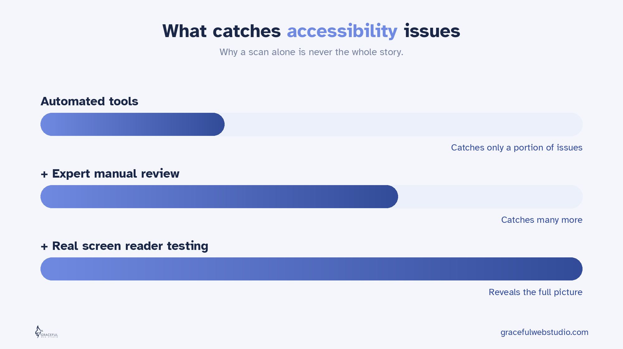
You do not have to guess. Here are the tools I use and trust, from the fastest first look to the most honest final test. Run more than one, because every tool catches different things, and no automated tool catches everything.
Tools to check your accessibility tree
| Tool | Best for | Cost | Skill level |
|---|---|---|---|
| Lighthouse (in Chrome DevTools) | A fast score for both accessibility and the new agentic browsing checks | Free | Beginner |
| axe DevTools (Deque) | Trusted developer-grade checks with very few false alarms | Free tier | Beginner to intermediate |
| WAVE (WebAIM) | Seeing issues laid right on top of your page, great for learning | Free | Beginner |
| ARC Toolkit (TPGi) | Deep expert inspection of structure, headings, and ARIA | Free | Intermediate to advanced |
| Chrome DevTools accessibility pane | Viewing the actual accessibility tree and each element's computed name and role | Free | Intermediate |
| A real screen reader (NVDA on Windows, VoiceOver on Mac) | The truth. Hearing your site the way it is actually experienced | Free | Any, with practice |
Start by running your own Lighthouse scan. In Chrome, open DevTools, find the Lighthouse tab, and run the accessibility category. For the new AI readiness checks, the easiest path is the free PageSpeed Insights website at pagespeed.web.dev, which now shows an agentic browsing result next to the usual scores. You can also run the agentic browsing category right in Chrome version 150 or newer, the regular up to date browser most people already have. A short while ago this was limited to a beta version of Chrome, but as of May 2026 it ships in the standard tool, though Google still labels it experimental. Write down your two scores. That is your baseline, and that is the number we move.
Here is the honest part most agencies will not tell you. Automated tools only catch a portion of real issues, never all of them. They cannot tell you whether your “Submit” button makes sense in context, or whether your heading outline actually tells a story. That judgment is human. So the automated scan is where you start, not where you stop. The real test is closing your eyes, turning on a screen reader, and trying to use your own site. It is humbling the first time. It is also the single most clarifying thing you can do for your business online.
Good news for Webflow users. Almost everything here is built into the platform if you use it the way it was designed.
You do not need to chase a hundred AI hacks. You need a website that is honest in its code, so that people, search engines, and AI can all understand it. The accessibility tree is where that begins, and it is now the number one signal of whether your site is ready for the AI era. Build it well once, and you earn three things at the same time: a site real people can use, a site search can read, and a site AI can recommend.
That is not a trend. That is just good building.
This post is about the number one factor in your agentic browsing score. Want to see your actual scores? Get a free AI Visibility Report from certified accessibility and Webflow specialists. We will manually check how your business shows up when people ask Claude for a recommendation, then explain your new Lighthouse agentic browsing scores in clear, plain language. You get a personalized report within 24 hours. No sales pitch, just value.
Request yours at gracefulwebstudio.com/ai-visibility-report.
Next in the series, Part 2: Layout Stability, why a jumpy page confuses both people and AI, and the popular design trends that are quietly failing this test. After that, Part 3 covers the llms.txt file and the honest truth about whether you need one, and Part 4 looks at WebMCP, the frontier where AI agents act on your site.
Written by Crystal Scott, Certified Professional in Web Accessibility (CPWA), Certified Webflow expert and founder of Graceful Web Studio.
Ethically optimize your site for AEO, GEO, and accessibility to get featured in AI search results and answer engines like ChatGPT, SGE, and Alexa.

Struggling with low website conversions? Learn five key fixes to improve UX, trust, and engagement to turn visitors into customers.
.webp)
A jumpy page makes people tap the wrong thing and makes AI agents fail. Layout stability is the second factor in the agentic browsing score.
We would love to meet with you face-to-face. Whether virtually or for a coffee. Request a free project quote, and let’s find the right solution for you! We review your site, set-up a disocvery session and map out goals for a website that grows your business.