Accessible Card Components: Linking With Purpose


Earlier today, I was building a new series of CMS-connected cards in Webflow—each designed to link out to external resources. The cards included a heading, a short description, an unlinked category tag, and a decorative arrow. At first glance, it seemed logical to wrap the entire card in a single link block. After all, the whole purpose of the card was to guide users to an external destination. But as an accessibility specialist and Webflow developer, I knew better.
This article shares what I implemented today, why I didn’t follow the default approach, and how you can build accessible, user-friendly cards that meet real-world WCAG expectations. Because accessibility isn’t an afterthought—it’s my strategy.
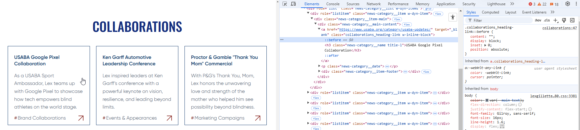
When building CMS-linked cards in Webflow, one common mistake is wrapping the entire card in a link block. While it may seem intuitive—after all, the card’s purpose is to link to an external resource—this can create serious accessibility and usability concerns.
Let’s break down why, and how to do it right.
When the entire card is linked, the screen reader’s accessible name for the link includes all of the card’s text content—heading, description, category, and more. That can result in link names well over 200 characters.
There’s no formal WCAG maximum for link length, but long link names:
💡 Golden Rule: Keep link text under 100 characters, ideally closer to 60 characters. Concise, descriptive links are easier to scan and more accessible.
Instead of wrapping the entire card, link only the card heading, which provides the clearest and most concise link purpose. Then use a ::before pseudo-element to visually extend the clickable area over the card while maintaining a single semantic link.
First, set the card wrapper to position: relative. Then use this CSS:
.collaborations_heading-link::before {
   content: "";
   display: block;
   inset: 0;
   position: absolute;
}
This ensures only one interactive link exists per card, preserving semantics while improving usability.
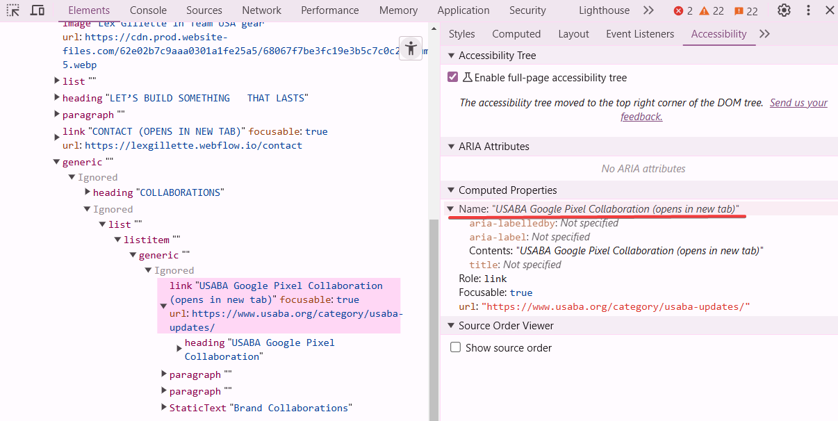
aria-labelledby or aria-label on a card wrapped in a link block to shorten a long link text. It will override all other text inside the element, hiding important context from screen readers.Links that open in new tabs should include a warning. This is helpful for:
While some designers choose to show a visible "(opens in new tab)" label, we chose to make our solution screen reader-only so that it doesn't interrupt the visual design flow or create visual redundancy across UI components.
Here’s the CSS we use globally to do this accessibly:
a[target="_blank"]::after {
  content: " (opens in new tab)";
  position: absolute;
  width: 1px;
  height: 1px;
  padding: 0;
  margin: -1px;
  overflow: hidden;
  clip: rect(0 0 0 0);
  white-space: nowrap;
  border: 0;
}
This ensures your message is delivered to assistive technology without cluttering your design. Just set your links to open in a new tab using Webflow’s link settings, and this CSS will take care of the rest.
Good link practices aren't just about accessibility—they directly benefit your SEO strategy too. Search engines rely on meaningful link text and internal structure to understand your content. Here's how accessible linking improves your visibility:
💡 Pro Tip: Use the heading of the destination page as your link text wherever possible. It strengthens both user understanding and SEO signals.
Accessible linking doesn’t just serve people—it also serves algorithms. Do it right, and you support usability and discoverability.
Good link text is:
Bad: “Click here” or “Read more”
Better: “Explore More Link Text Guidlines”
Avoid duplicate link names. Avoid overly short or overly long links. Link text should clearly state the destination.
When I’m building Webflow components—especially complex CMS collections like linked resource cards—I always ask myself: What would this experience be like for a screen reader user? For someone scanning fast? For someone relying on voice or keyboard navigation?
This mindset guided every decision I made while structuring those cards today. I referred to Chapter 3 of The Web Accessibility Cookbook by Manuel Matuzovic—specifically his fourth solution on page 89, which inspired my use of pseudo-elements to visually expand the clickable area while maintaining semantic clarity.
Accessible link strategy is about more than WCAG compliance. It’s about:
Accessible link strategy is about more than WCAG compliance. It’s about:
Use concise headings, give link text purpose, avoid redundant interactions, and signal external destinations. These small choices add up to a better experience for all.
If you’re building linked cards in Webflow, do it with accessibility in mind—from the link strategy to the semantic structure.
Want to know what assistive tech users actually experience?
Open up your dev tools and take a peek,
Inspect the structure, don’t just critique.
Unfold the tree, accessibility!
It’s where the real truth comes to be.
🌿 If it doesn’t make sense in the tree, it won’t make sense to me.
(I'm a poet and you didn't even know it!)
We build accessible, conversion-focused Webflow websites for businesses across Yakima and the US. Crystal Scott is a Certified Professional in Web Accessibility (CPWA) with 11+ years of front-end experience.
Our services:
Transparent pricing on every service page. Request a quote and get a response within one business day.
We would love to meet with you face-to-face. Whether virtually or for a coffee. Book a call, and let’s find the right solution for you! We review your site, map goals, and then deliver a clear plan and quote.