Google's Agentic Browsing Lighthouse Scoring Factor: Layout Stability and CLS
.webp)

Part 2 of the AI Visibility Series. Why a jumpy page loses customers and confuses AI, and the popular design trends that are quietly failing this test.
In Part 1, we met the accessibility tree, the machine-eye view of your website. This time we are looking at something you can actually feel when it goes wrong. The page that jumps. You go to tap a button, the page shifts, and you tap an ad instead. You start reading, and the text leaps down the screen. It is a small thing that makes a site feel cheap, and it is now one of the things AI is graded on too.
This is the second factor in Google's new agentic browsing score, and it has a name you may already know: layout stability.
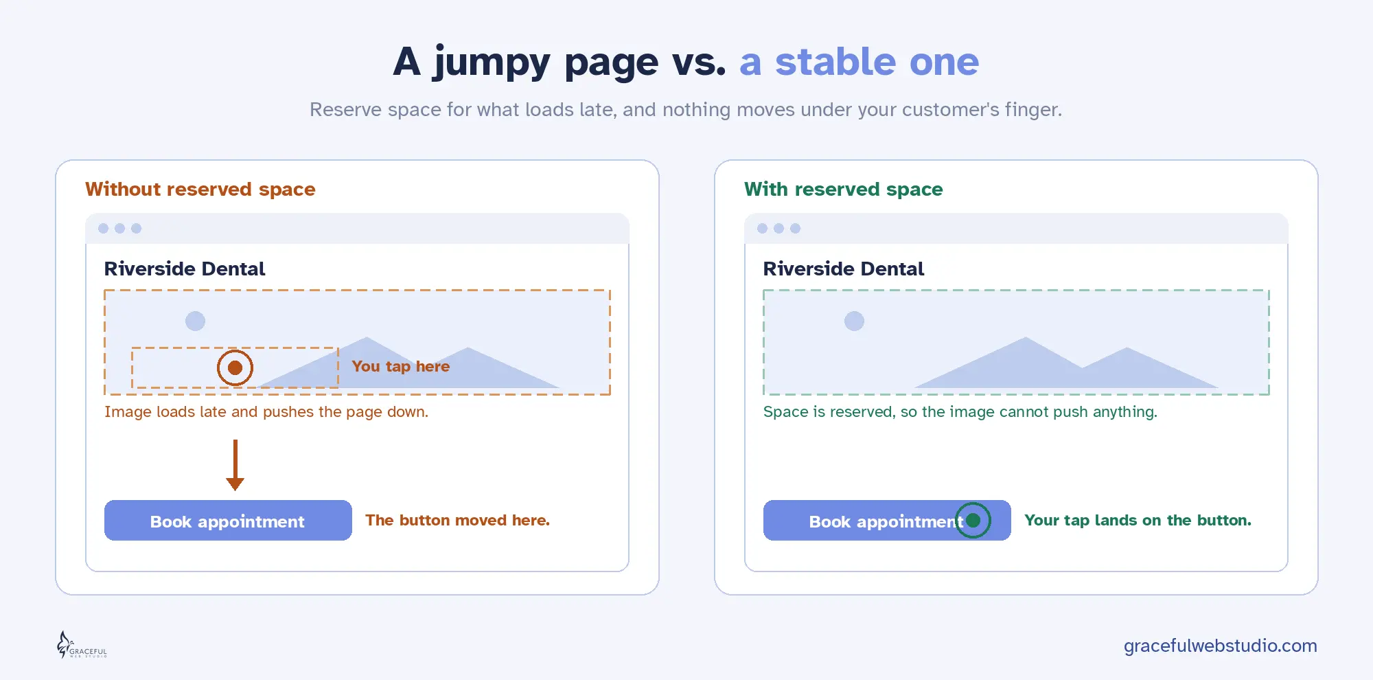
When a page loads, the pieces do not all arrive at once. Text shows up first, then an image loads, then a font swaps in, then a cookie bar drops down from the top. Every time one of those late arrivals pushes the rest of the page around, that is a layout shift.
Google has measured this since 2020 with a Core Web Vital called Cumulative Layout Shift, or CLS. It adds up how much of the page moves and how far it travels. A calm, stable page scores near zero. A jumpy page scores high, and high is bad here. The goal most teams aim for is a CLS of 0.1 or less.
You have felt this as a person. You reach for the “Add to cart” button and the page shoves it down half a second before your tap lands, so you hit the wrong thing. Annoying on a good day. On a checkout page, it can cost a sale.
Here is what changed. Layout stability used to be about human comfort and search rankings. Now it is also about whether an AI agent can use your site at all.
AI agents do not look at your page the way you do. Many of them work from screenshots and coordinates. They find the “Book appointment” button at a certain spot, then act on that spot. The trouble is that agents move fast, far faster than a person. A human sees the page twitch and pauses. An agent has already committed to the click. If the button moved in that instant, the agent taps empty space, or worse, taps the wrong control. Google's own guidance puts it plainly: agents that rely on screenshots get confused when your layout keeps shifting.
For an agent trying to complete a real task for your customer, a purchase, a booking, or a form, that is not a small glitch. It is a failed job. The agent understood your page and still got it wrong, because the page would not hold still.
So layout stability now counts in three places at once. It is a Core Web Vital that affects your search performance. It shapes whether a human taps the right thing. And it is the second pillar of the agentic browsing score that decides whether AI can act on your site. One fix, three wins.
Here is the part that surprises people. Some of the most popular, most expensive-looking design choices of the last few years are the exact things that break layout stability. A site can win a design award and still fail this audit. These are the patterns I see most often.
Design trends that can break layout stability
| Popular pattern | What goes wrong | What it costs people and AI |
|---|---|---|
| Full-screen loader or long intro animation | The real page is built behind the intro, then snaps into place when it clears | Delays the page for everyone, and an agent that looks mid-intro sees the wrong screen |
| Reveal-on-scroll and pinned sections (heavy ScrollTrigger or GSAP) | Content is added or moved as the visitor scrolls, pushing the rest of the page | People lose their place, and agents that scroll and screenshot misjudge where things are |
| Parallax that moves layout, not just the background | Real elements change position as a side effect, not just the decorative layer | A jittery feel for people, and moving targets for an agent trying to click |
| Images, videos, or embeds with no set size | The browser cannot reserve space, so text jumps when the media finally loads | The classic tap-the-wrong-thing moment for people, and a missed click for agents |
| Late popups, cookie bars, and promo strips | They drop in after load and shove your content down | People tap the wrong button, and a fast agent hits the banner instead |
| Brand font swapping in late | Text is laid out in a fallback font, then reflows when your font arrives | Headings jump a beat after load, throwing off both the reader and a screenshot |
One important thing, before you panic and strip every animation off your site. Motion is not the enemy. The problem is never movement in general. It is movement that pushes other content around. There is a clean line between the two, and it is worth learning the difference.
Animations that use transform and opacity, things like sliding, fading, scaling, and rotating, do not count against layout stability at all. The browser handles them in a separate layer, so they never shove the rest of the page. You can keep those. What hurts is animating the properties that change the document itself, like height, width, top, left, and margin, or revealing content that pushes everything below it down. Same beautiful effect, two very different results. A good developer simply chooses the version that does not move the furniture.
A stable page is not a boring page. It is a page that reserves space for everything before that thing arrives, so nothing has to jump. Here is the practical checklist.
Do these, and your page holds still for everyone. People, search, and AI.
You do not have to guess whether your page is stable. Here are the tools I trust, from the quickest look to the most thorough.
Tools to check layout stability
| Tool | Best for | Cost | Skill level |
|---|---|---|---|
| Lighthouse (in Chrome DevTools) | Your CLS number, plus the layout stability check in the agentic browsing category | Free | Beginner |
| PageSpeed Insights | A quick CLS reading with both lab and real-world field data | Free | Beginner |
| Chrome DevTools Performance panel | Recording a load and seeing exactly which elements shift and when | Free | Intermediate |
| Core Web Vitals Visualizer (Chrome extension) | A quick live overlay that highlights which elements are shifting | Free | Beginner |
| Search Console Core Web Vitals report | Seeing which live pages fail CLS for real visitors over time | Free | Beginner to intermediate |
| DebugBear | Ongoing monitoring that catches shifts as they appear, not just once | Paid, free trial | Intermediate |
Start with the simplest test of all, and it costs nothing. Open your site on your phone, on a normal connection, and just watch it load with fresh eyes. Does anything jump? Does a button move right as you reach for it? Then run Lighthouse in Chrome, read your CLS number, and run the agentic browsing category to see the layout stability check for agents. For the truest picture, throttle your connection to a slow speed in the tools and watch again, because that is the version of your site a real visitor on a busy network actually gets.
One honest note. Layout shift is sneaky because it does not only happen on load. It can strike later too, when a popup fires, when you scroll into a lazy-loaded section, or when you click something that injects new content. So watch the whole experience, not just the first second.
Good news for Webflow users. The platform gives you most of what you need, as long as you use it on purpose.
A stable page is a quiet kind of quality. Nobody notices when nothing jumps, and that is the point. Reserve space for what is coming, animate without shoving the page around, and your site holds still for every visitor, the human reaching for a button and the AI agent acting on their behalf. The same calm page that feels good to people reads as ready to search and to AI.
That is not a trend. That is just good building.
Curious how your site scores on stability and the rest of the AI readiness checks? Get a free AI Visibility Report from certified accessibility and Webflow specialists. We will manually check how your business shows up when people ask Claude for a recommendation, then explain your new Lighthouse agentic browsing scores in clear, plain language. You get a personalized report within 24 hours. No sales pitch, just value.
Request yours at gracefulwebstudio.com/ai-visibility-report.
Next in the series, Part 3: the llms.txt file, what it is, the honest truth about whether you need one, and the two-worlds confusion between Google Search and AI agents.
Written by Crystal Scott, Certified Professional in Web Accessibility (CPWA) and founder of Graceful Web Studio.
We would love to meet with you face-to-face. Whether virtually or for a coffee. Book a call, and let’s find the right solution for you! We review your site, map goals, and then deliver a clear plan and quote.