Making Relume Components Accessible: Lessons from a Slack Banner Integration

Recently, a client came to me with a vibrant new Slack community and wanted a way to promote it on her website. Naturally, I reached for my trusted Relume Library and selected Banner Component #7 — clean, stylish, and perfect for a quick announcement.

Like many Webflow professionals, I love how easy it is to copy and paste Relume components into a project. But as always, copy/paste is just the start — accessibility takes intention.
P.S. Developers if you are not already subscribed to Relume - please subscribe now or this tutorial will not work for you. 😉
After implementing the component, I ran a quick accessibility pass and — no surprise — found several issues that needed to be addressed before this could meet WCAG 2.2 conformance.
The main bolded text visually looked like a heading, but it was just a styled <div>. I converted it to a <h2> because it introduces new content, but that changed its size. To preserve the smaller styling, I created a new class to override the default heading styles without stripping semantic meaning.
Pro tip: Never sacrifice structure for style. Use headings for headings and control appearance with classes.
Below the heading, the supporting line of text was just a loose text node — not even wrapped in a semantic element. I turned this into a proper <p> tag to ensure screen readers can identify it as body text.
The component used a visual button that was actually a styled link. Relume often labels these as “button” in their UI, but they’re <a> tags under the hood. Since this link navigates to an external Slack page, I:
target="_blank" to open in a new tabButtons perform actions. Links navigate. Know the difference and use the right element.
The close icon — visually an “X” — was built using a link as well. That’s a problem because:
<button>So I:
aria-label="Close" for screen readersThe Slack logo was coded as meaningful and exposed to screen readers, even though the word “Slack” appeared directly beside it. I:
aria-hidden="true" to the SVGIf an icon disappears on mobile, it should be decorative — not essential for understanding content.
If you're using Relume components in your Webflow projects, don’t assume they’re accessible out of the box. Here's what I always check:
<h1>–<h6>)?<p> tags?aria-label)?role="button", role="tab", etc.)?aria-hidden="true"?
Check out the live accessible banner for yourself and while you are at it check out her awesome community too!
Relume is an incredible tool for speeding up Webflow builds, but like all component libraries, it needs an accessibility expert’s eye. Building inclusive websites doesn’t happen by default — it happens by design.
If you’re using Relume, take the time to review your components before going live. Your users — all of them — deserve better.
We build accessible, conversion-focused Webflow websites for businesses across Yakima and the US. Crystal Scott is a Certified Professional in Web Accessibility (CPWA) with 11+ years of front-end experience.
Our services:
Transparent pricing on every service page. Request a quote and get a response within one business day.

Compare Yakima web studios and see why Graceful Web Studio leads in accessibility, SEO, and design, all at mid-range pricing.
Ethically optimize your site for AEO, GEO, and accessibility to get featured in AI search results and answer engines like ChatGPT, SGE, and Alexa.
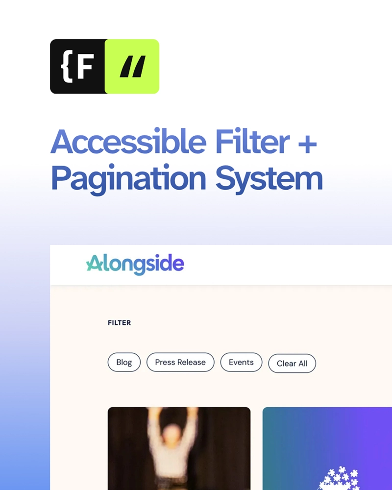
How we built a fully accessible Webflow blog with filters, search, and pagination using Finsweet Attributes, plus tips to avoid common pitfalls.
We would love to meet with you face-to-face. Whether virtually or for a coffee. Request a free project quote, and let’s find the right solution for you! We review your site, set-up a disocvery session and map out goals for a website that grows your business.